Keywords: UX research, UI prototyping, Branding, User-centered, User testing, web, Figma, Adobe Illustrator, Usability, Gamification, Learning platform, Inclusivity, social sustainability.
In Sweden in 2021, women represented 29% of new students in information and communication technologies. In Sweden in 2021, studies have demonstrated that young adults without highly educated parents are less likely to pursue higher education early in life.
We at CodEx aim to close the gap. We aim to support those young adults left behind because they had the so-called wrong interests early in life or because they learn differently. We encourage them to become better solution-seekers and are there for them when they seek answers and have no one to turn to.
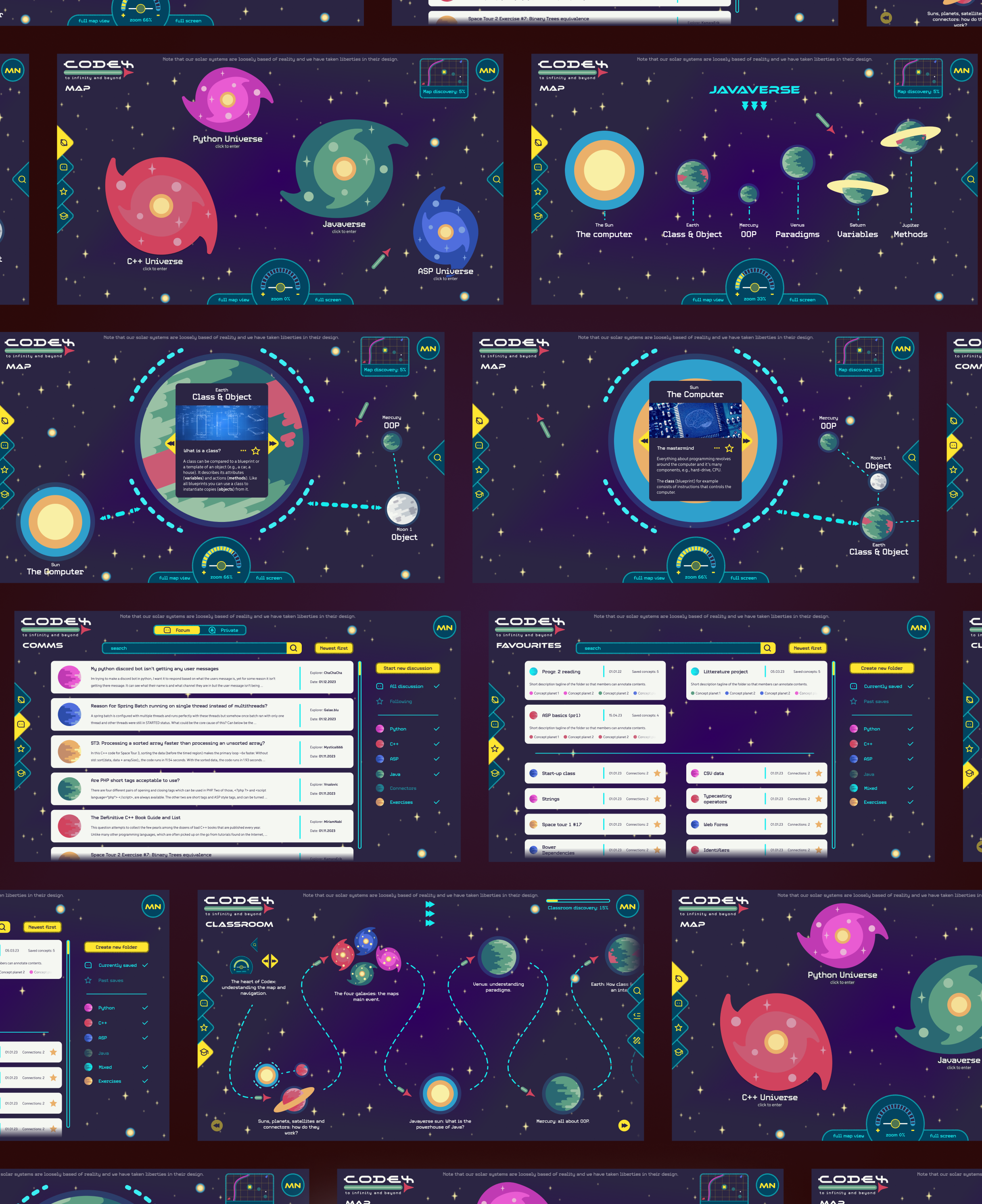
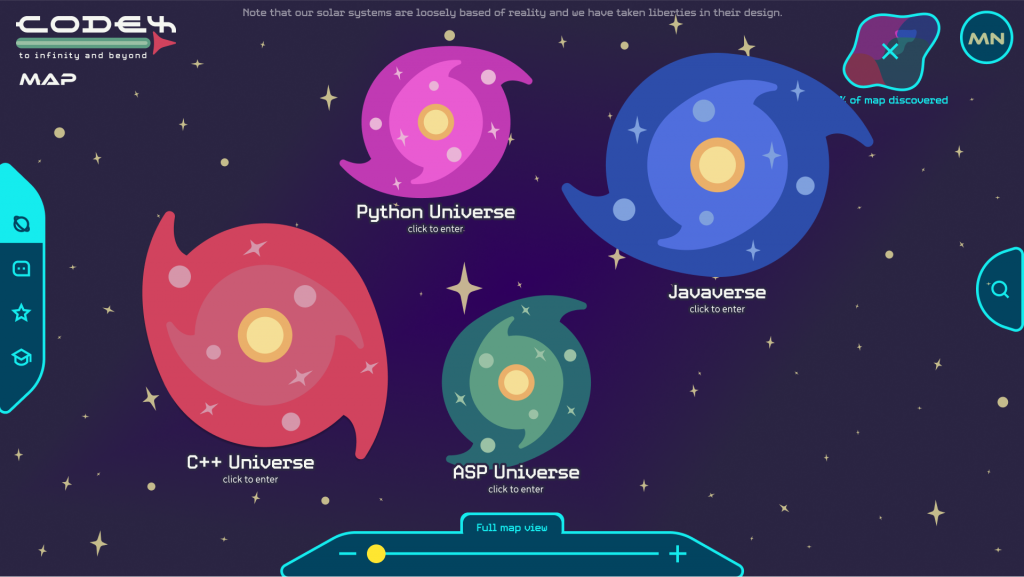
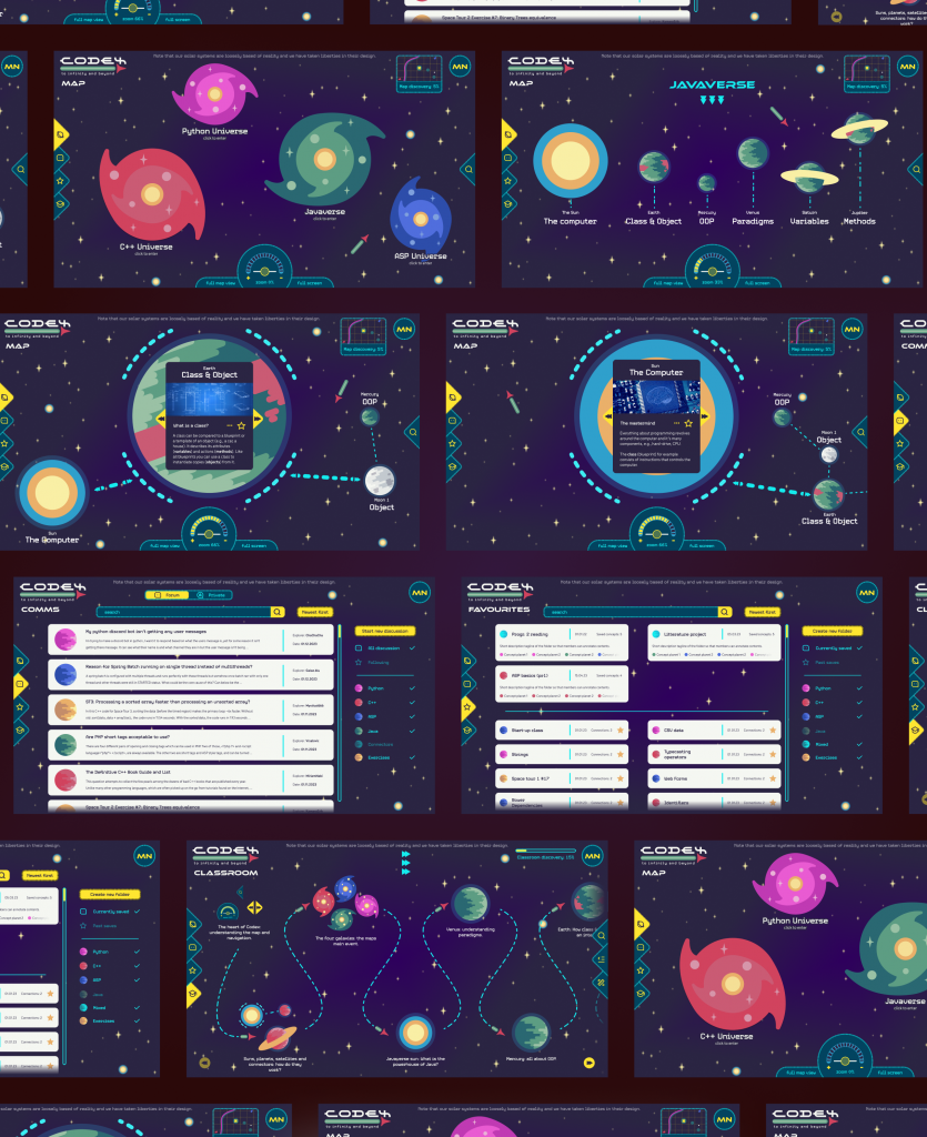
Our team of amazing UX-designers and teachers have innovated a platform that supports learning coding and understanding key concepts of programming. How? Through visualisations, mapping, forums and gamification. This is the fruit of intensive collaboration with experts and the young adults seeking to grab the bull by the horns. We went through phases of brainstorming, user research, requirements gathering, low- to high-fidelity designing and product evaluation with users. This is how we gave our educational teaching platform has a competitive edge: programming truly for all, at any time, anywhere.
Our dream is to work with educational institutions and teachers. Together we can improve young adults’ relationship with the beast of programming, to move from brute-forcing code to a myriad of educational opportunities and into the Computer science job market that so desperately needs new recruits.
Final Version
Users
Primary: Young adults aged 13 to 19 with the primary goal of learning coding for educational purposes and secondary goal to deepen their understanding of programming for future opportunities.
Secondary: Adults such as parents, teachers and other professionals of educational institutions such as the state with the primary goal of teaching programming and related skills and the secondary goal to prepare young adults for the tech job market.
Requirements
Functional
| · Provide learning material with the form of concept mapping, visualization, applied exercises or quizzes to ensure that fundamental concepts and their interrelations have been fully understood. |
| · Help the user get a better grasp the overall picture and “connecting the dots” on how the code and the concepts are connected and intertwined. |
| · Support in-depth understanding of concepts through features such as a search engine, a community forum, an AI and/or a teacher chat. |
| · Gamify the learning process through measurable tests of knowledge and working towards defined goals. |
| · Personalise the user learning experience by allowing them to build a library of relevant definitions, exercises, and concepts. |
Non-functional
| · Focus on creativity as a driver for learning programming for young adults. |
| · Appeal to all genders through balanced content of all fields of interests |
| · Create affordability by creating an interface that is familiar in its learning solutions and intuitive in its usage. |
| · Overcome reluctance to overstep boundaries of privacy with known experts such as teachers by providing other avenues of communicating with outside experts. |
| · Provide the possibility for vetting the information for teachers so students don’t apply sub-optimal explanations of complex concepts. |
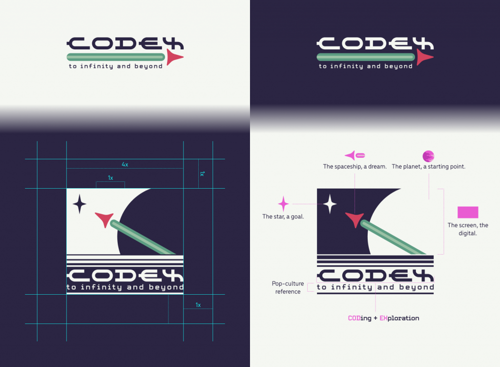
Branding
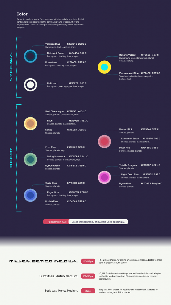
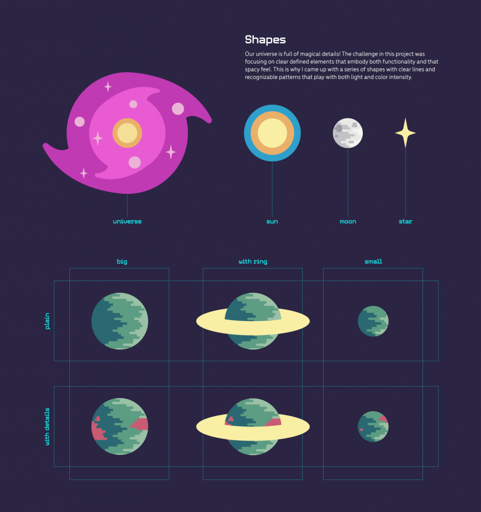
UX Research
Scenarios

Persona
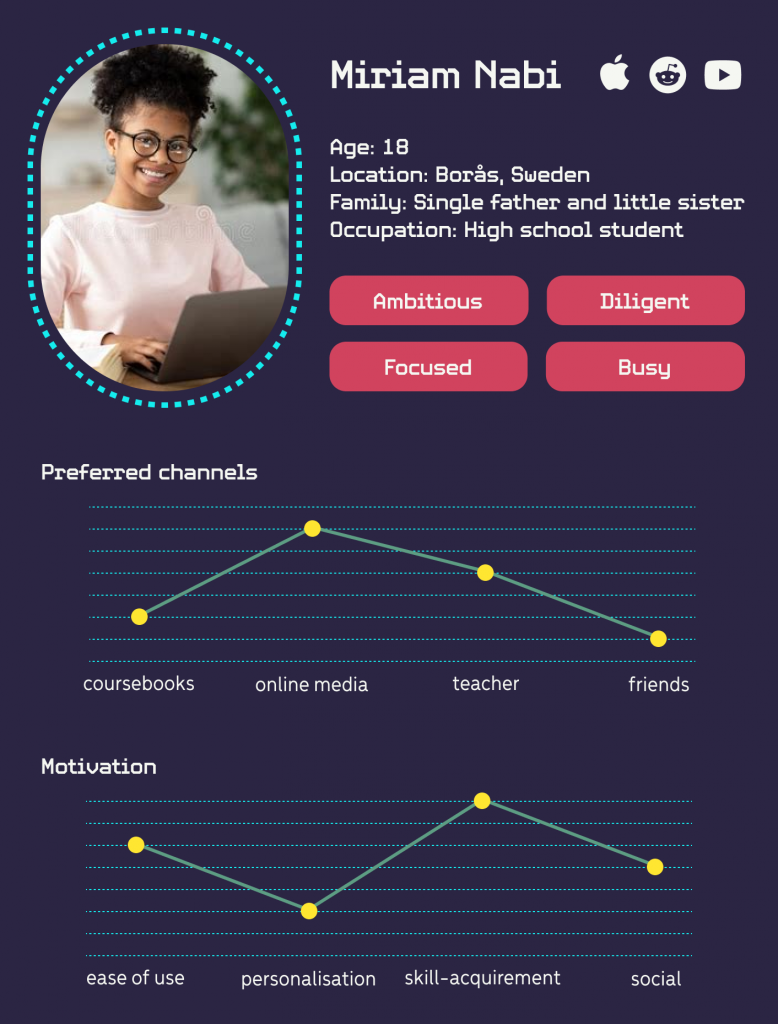
Miriam is a hard-working high school student with ambitions of studying IT at university and building a successful career. Getting the appropriate knowledge and good results in Programming 1 and 2 will help her to achieve that goal.
Since her mother is out of the picture and her father works a lot to financially support them, she takes care of her little sister after school and has a bulk of the housework to do. So her time to study at home is limited. Often she also struggles to understand new concepts and their relationships as the provided course material is very text based and she tends to be a visual learner. It is also hard to get answers to pertinent questions from a knowledgable source, as her course is only once a week.
All in all, she enjoys coding and is knowledgable of new technology, but is looking for a new tool to make her study time more effective.
Data Gathering: Online survey with target users
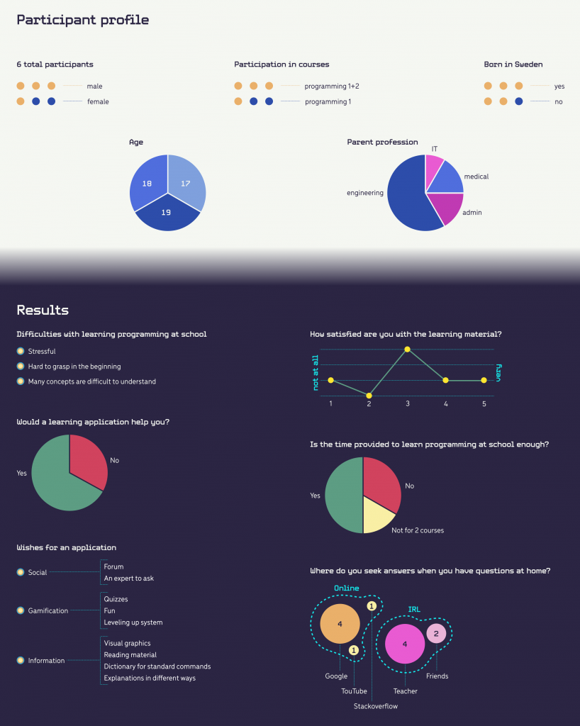
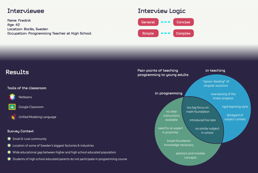
Data Gathering: Interview with expert
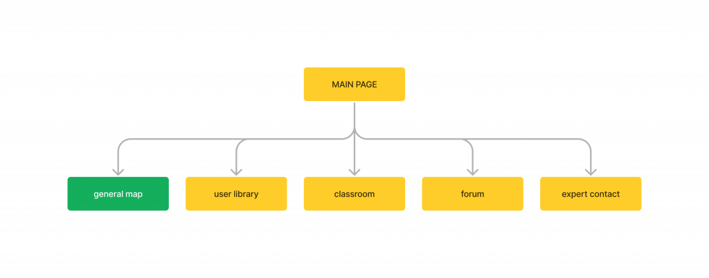
Information architecture: Mapping MVP
UI Prototyping
Low-fidelity
User testing
Phase 1: Mid-fidelity wireframe
Aim: Involve users early in the development process and collect data to enhance usability and user experience in later stages.
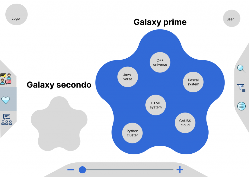
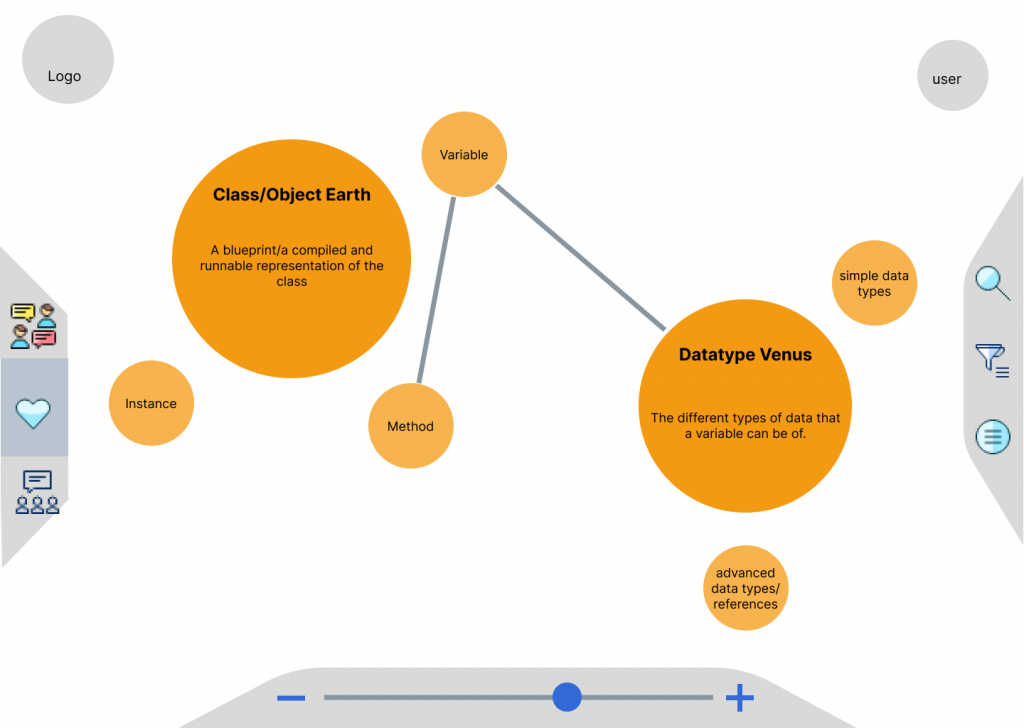
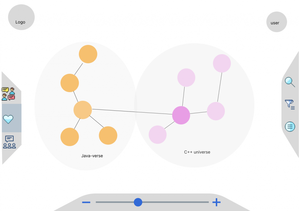
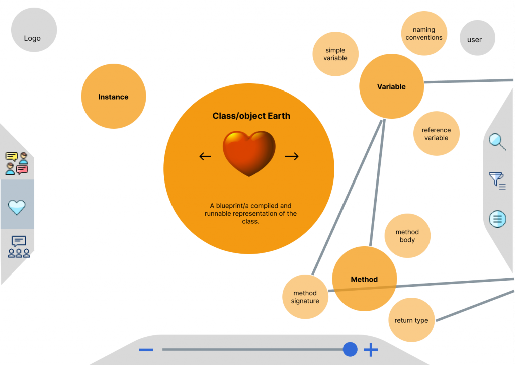
Structure: Using the “think aloud” method, we observed users completing a list of tasks focused on map content and navigation in our interactive mid-fidelity prototype. This was followed up by a simple questionnaire to gather quantitative and qualitative data points.
Results: Users found some buttons were hard to recognise and the search function lacking in direct information access. Users also suggested they would enjoy further personalisation such as dislike buttons or sorting relevant information. Navigation of the map was largely a success and was described as “intuitive”.
Implementation: Change of icons, search bar optimised for cursor and click efficiency , greater focus on personalisation of information.
Phase 2: Targeted branding
Aim: Study preferences of our target group concerning branding and verify the effect of visual elements of gamification.
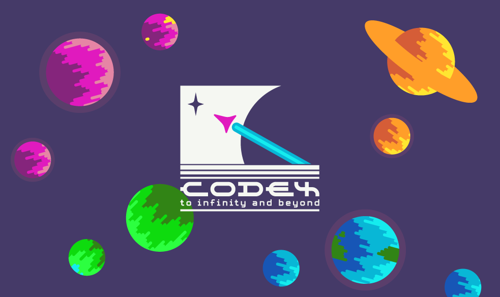
Structure: We presented two colour themes aimed at user bases with different levels of maturity and interests. Both remain playful and offer a variety of colours to transmit information. We asked users for preferences and quantitative feedback to justify their choice.
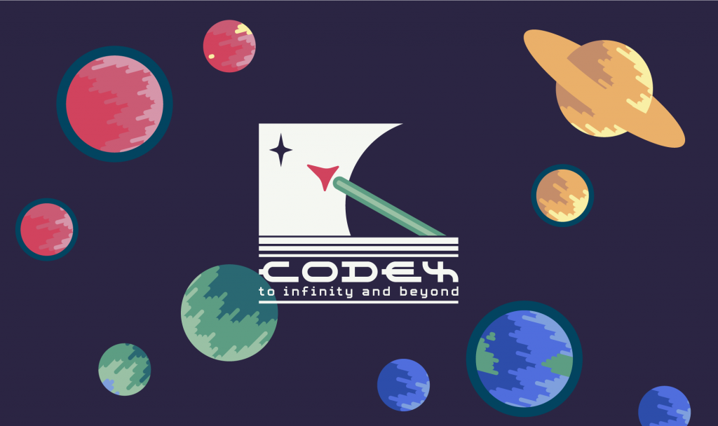
Results: Users all preferred the darker theme out of unforeseen practical reasons: eye strain for prolonged screen-staring. They were overall pleased with the theme and excited at potential prospects of a practical web-application with such a branding. User gender or exact age did not influence answers noticeably.
Implementation: Further development of the darker theme and adding of additional assets to add detailing.
Phase 3: Interactive high-fidelity
Aim: Gather qualitative data abiding to industry standards of usability and feedback for further improvements.
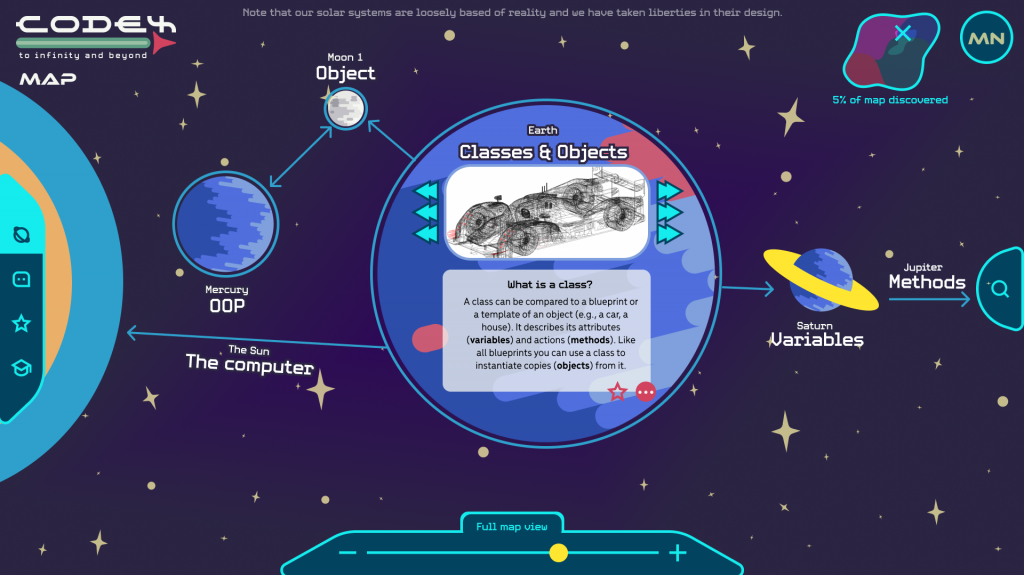
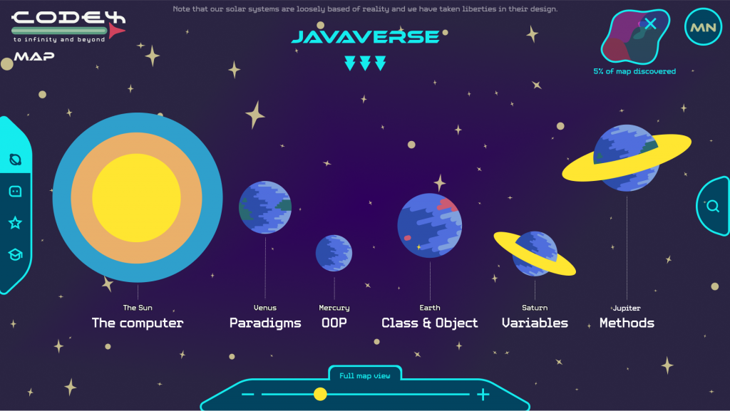
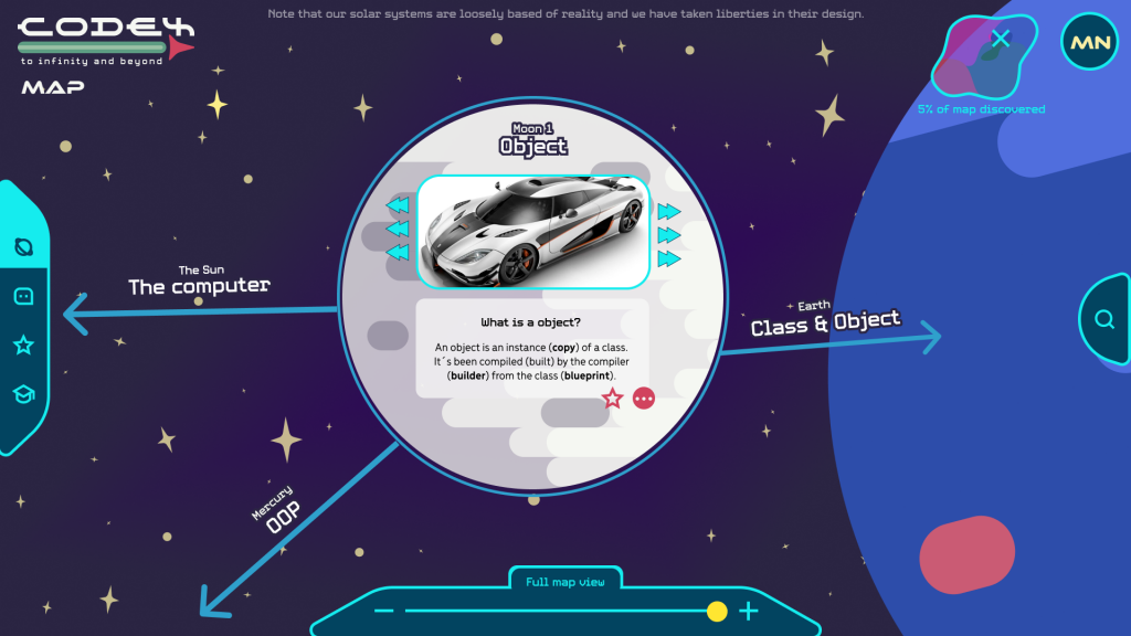
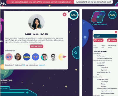
Structure: We recruited two sets of users:one group of primary target users (young adults) and one group of secondary target users (programming and educational experts). We gave them access to our high-fidelity prototype for a five to ten minute exploration. This time, we used the System Usability Scale (SUS) to gather usability scores.
Results: The average SUS score was 75.8, which is considered above average. Feedback included confusion about the order of planets, the importance of titles, some gamification elements. Users also expressed appreciation and curiosity about the space theme, the search option and indicators of user location on the map.
Implementation: Change the titles’ sizes, give the title to pages for clarification, make the background stars transparent, introduce a color differentiation between galaxies, add descriptive deatils to gamification elements.
