Keywords: UX research, UI prototyping, Branding, User-centered, User testing, Information Architecture, mobile, Figma, Adobe Illustrator, inclusivity, accessibility, usability.
Cross Klubb is a mobile application and that promotes inclusivity and the well-being of students of Chalmers and University of Gothenburg. Through user-centred design providing positive and engaging user experiences, this app supports students’ mental health and overall wellness by improving their participation in social activities and promoting quicker integration into local society. We also explored concepts of well-being and the use of technologies to personalize the user experience and provide targeted support to students.
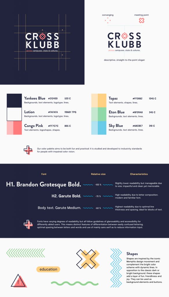
Our multidisciplinary team went through an intensive phase of user research, data gathering and analysing to extract user needs and product requirements. With my lead we then designed intuitive, user-friendly, and tailored prototypes for user testing. As a designer with branding experience I individually put together and tested typography, colors and shapes that would fit a jovial and inclusive application.
Final version
Users
Primary: Swedish and international students that moved to Gothenburg with the primary goal of joining activities to alleviate loneliness through social bonding and secondary goal to create activities to form communities.
Secondary: Facilitators such as associations and clubs with the primary goal of having people join their activities to form real life social networks and secondary goal to expand their member base.
Requirements
- Overcome a written language barrier by making information available in Swedish and English.
- Make access to the platform student only.
- Enable inclusive access to events by encouraging to define noise, crowds and alcohol presence.
- Encourage cross-university mingling by having quick access to Gothenburg University and Chalmers activities on the same platform.
- Collect scattered data from across platforms in one spot.
- Make user data collection a hundred percent optional without hindering access to activities.
- Visually appeal to a wide gender-neutral user base through fun color scheme and design elements.
Branding
UX Research
Personas and scenarios
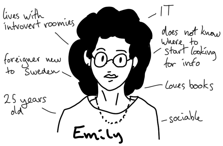
Emily just moved to Sweden four months ago and did not know anyone in Gothenburg prior. She could not make it to welcome week due to schedule issues. She feels to have missed a crucial step in socialising and now has a hard time making friends even though she is extroverted.
She lives in a dorm but all other room-mates are introverted and mostly speak Swedish with each other. She would love to speak Spanish with someone or do a language exchange but it is hard finding accurate information across platforms!
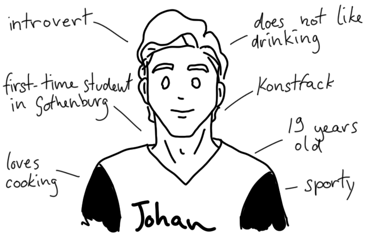
Johan is from Borås and decided to move to a bigger city for studies. He participated in the welcome week but hated how crowded and loud it was. He also does not like drinking and has a hard time making friends at parties anyhow.
He could join his own fraternity but does not like their activities much. He wants to join a regular basket ball session or cooking session to meet new people, but he does not have Facebook due to privacy reasons! The current websites with information about clubs and activities are cluttered and confusing to him.
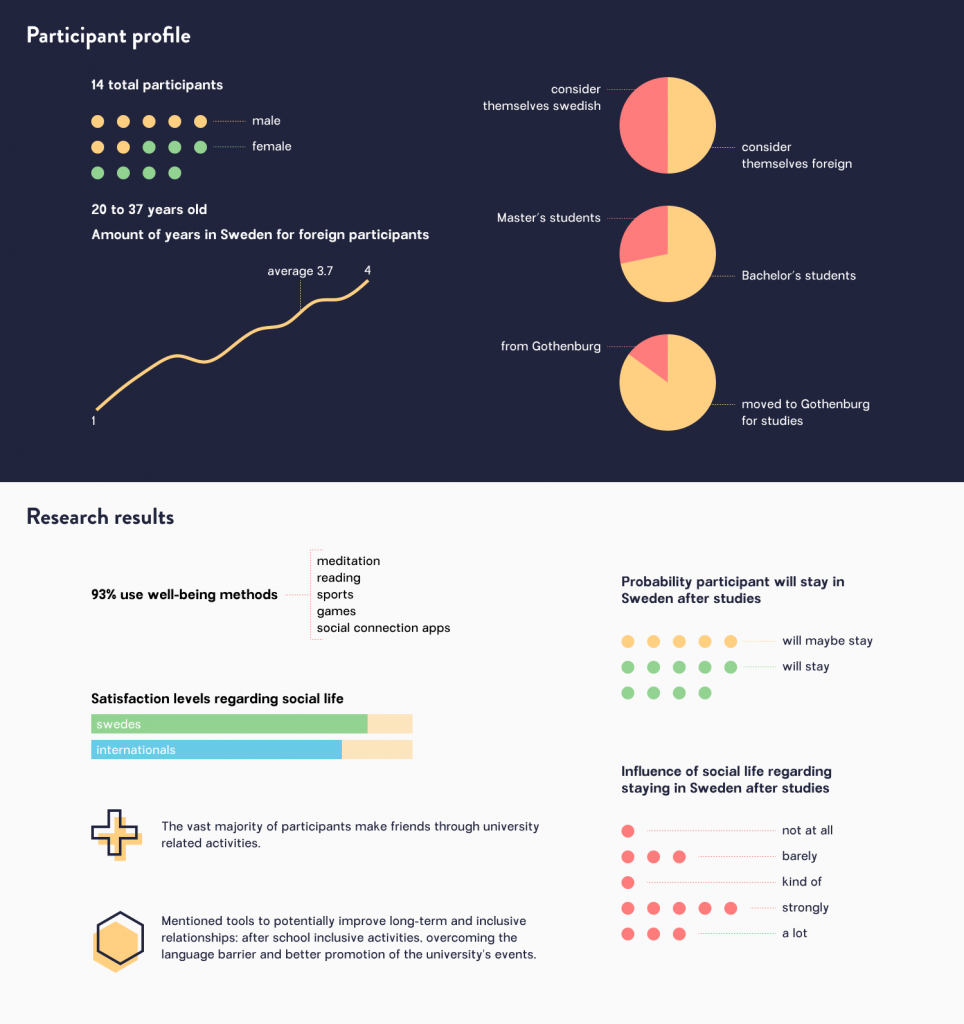
Data gathering: Online survey
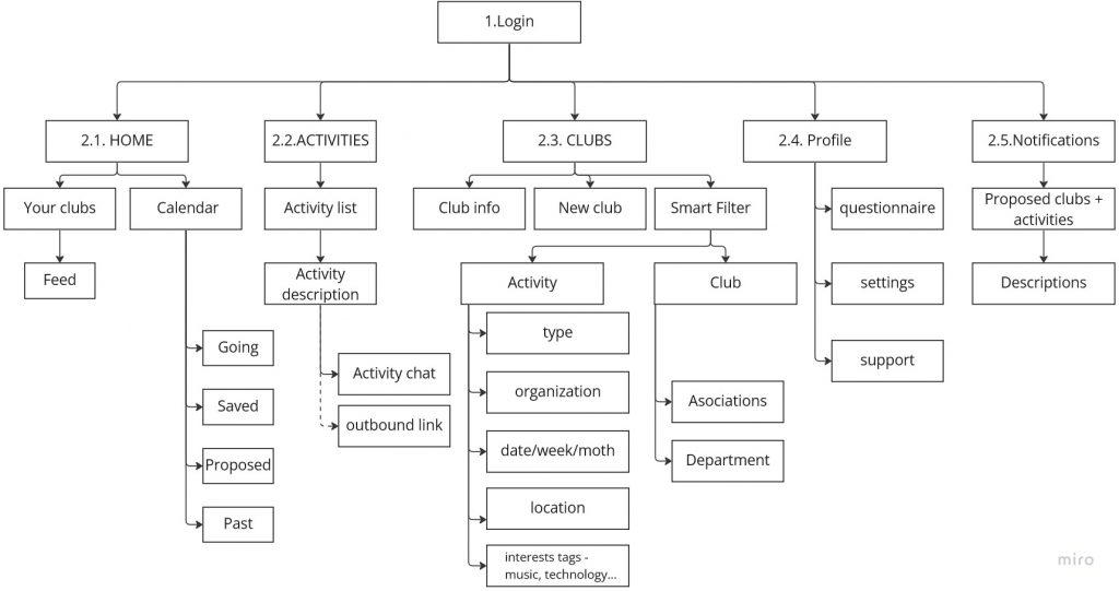
Information architecture: Mapping MVP
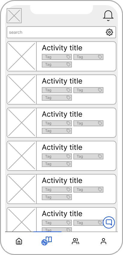
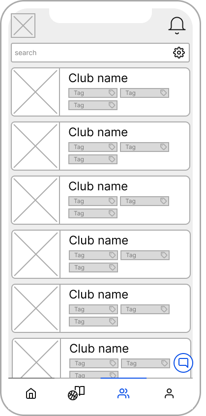
UI Prototyping
Low-fidelity
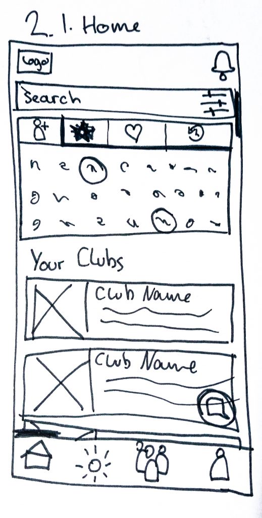
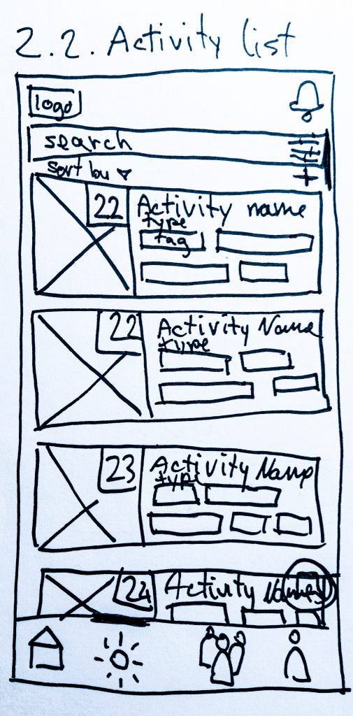
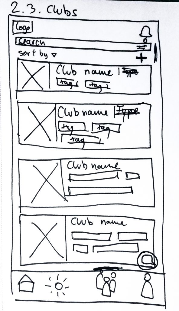
I took on the first stage of interface prototyping: sketching low-fidelity designs following the structure of our sitemap to facilitate an internal review.
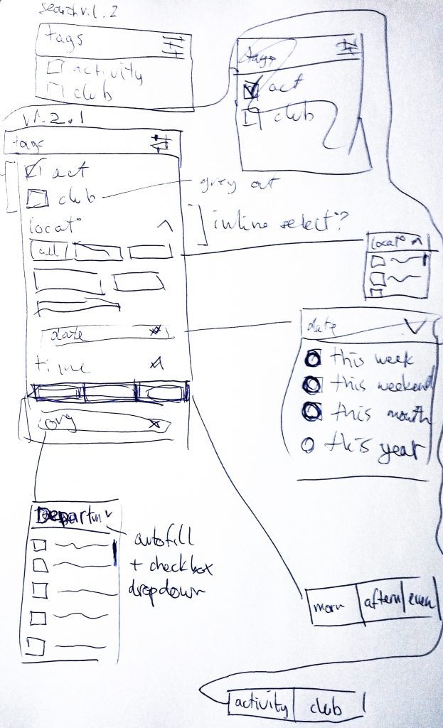
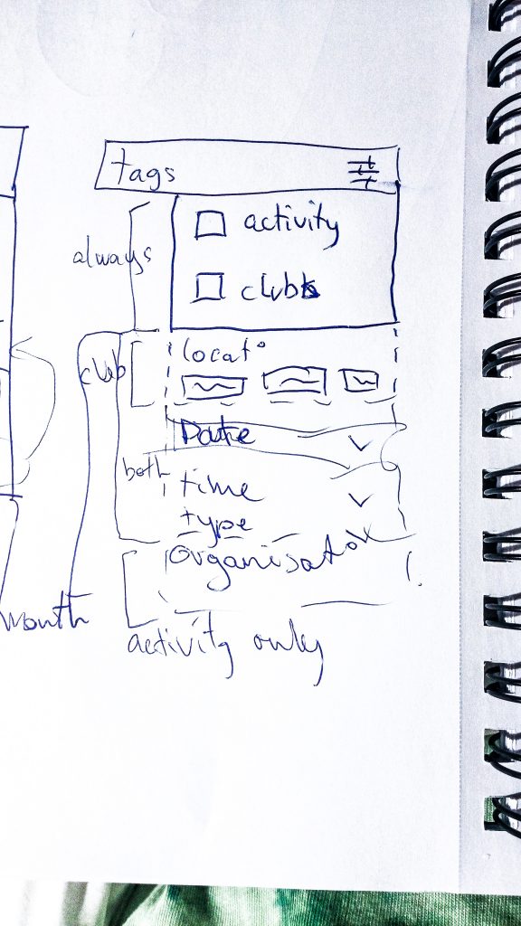
The feature I struggled with most was the smart filter. How does one design an intuitive smart filter that contains a wide array of information types? Benchmarking smart search features of my preference in applications, I decided to implement an array of controls for the filter options that included dropdown menus, autocompleting fields and multiple selection boxes.
The internal digital review of the low-fidelity pages of our application helped bring up design pain points such as icon meaning, icon placements, chat box functionalities and information density. Some of these elements saw meaningful changes in the mid-fidelity design and others would undergo additional scrutiny during our user evaluation.
User testing
Evaluation: Structure and aim
Firstly, we wanted to evaluate usability. Secondly, we wanted to explore user opinions on the app utility. We designed an interview using heuristics for HCI evaluation as laid out by Nielsen. We split the evaluation into phases of unstructured and structured interviews. Our goal was to give test users an opportunity to communicate their issues freely and to discover new insights. The evaluation was split into three phases:
Phase 1: User Vision
A natural observation study of the user exploring the app freely with think-aloud techniques. This allows qualitative insight into spontaneous impression users have of the app. This included the graphical layout, colors, icons, information structure, ease of interpretation and navigation, and level of intuitive app usage.
Phase 2: User Testing
More specific and fine-grained insight into app mechanics. We designed a number of tasks in accordance with our heuristics in order to conduct a guided observation. During this phase, we also measured metrics to gather quantitative data on success rates, time spent doing different tasks, and also rating and feedback from the user on specific questions.
Phase 3: Follow Up Questions
To study user impressions of the app after usage. Further qualitative data and insights into the usability of the app, focusing on different areas than in Phase 1. In addition, this phase served to help us get qualitative information from the user about the utility of the app, to give us insight into user opinions about whether it could serve the purpose of promoting well-being.
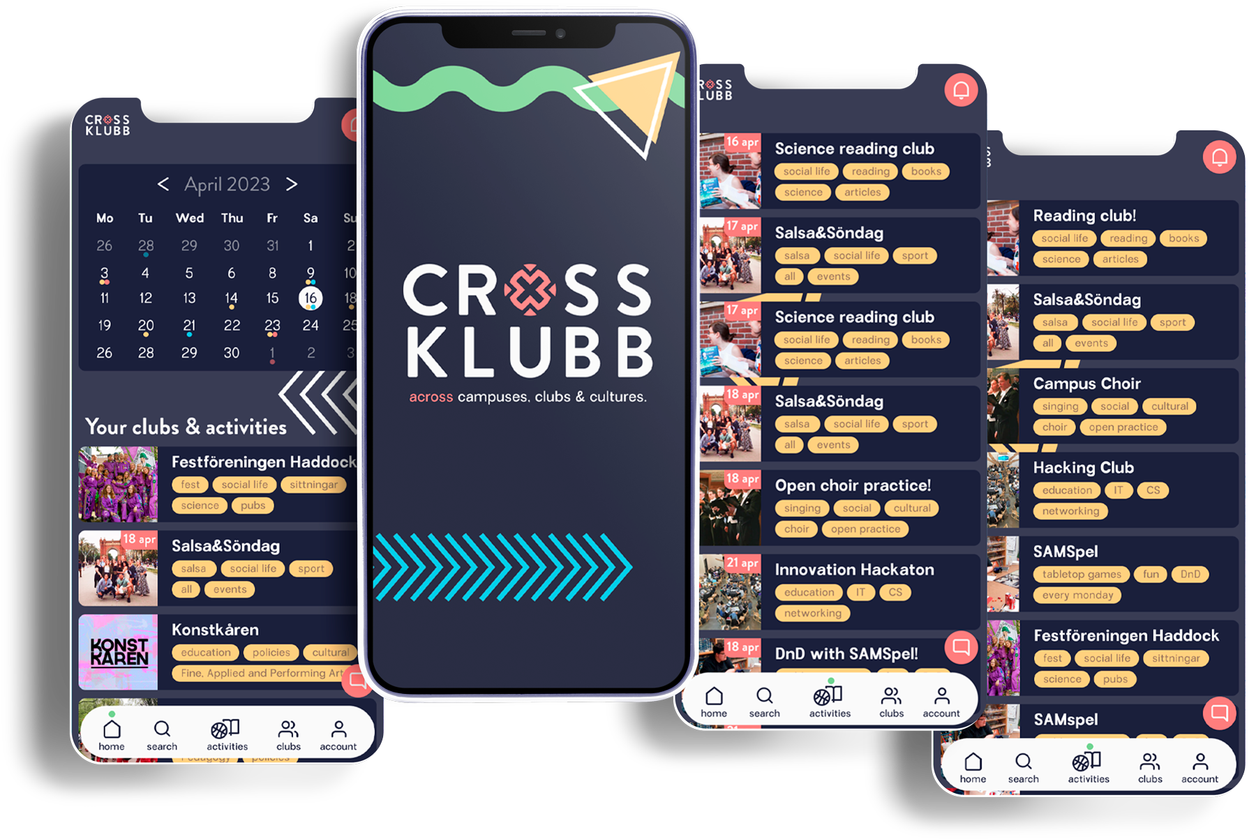
Interactive: Mid-fidelity
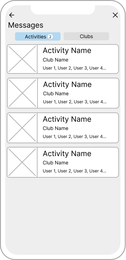
The clickable Figma prototype can be found here. Due to time restraints, one team mate and I focused on exploring three actions planned for our user evaluation: exploring and finding information about a past event in the calendar, finding a suitable activity for a casual basketball player and contacting and association about their activities.
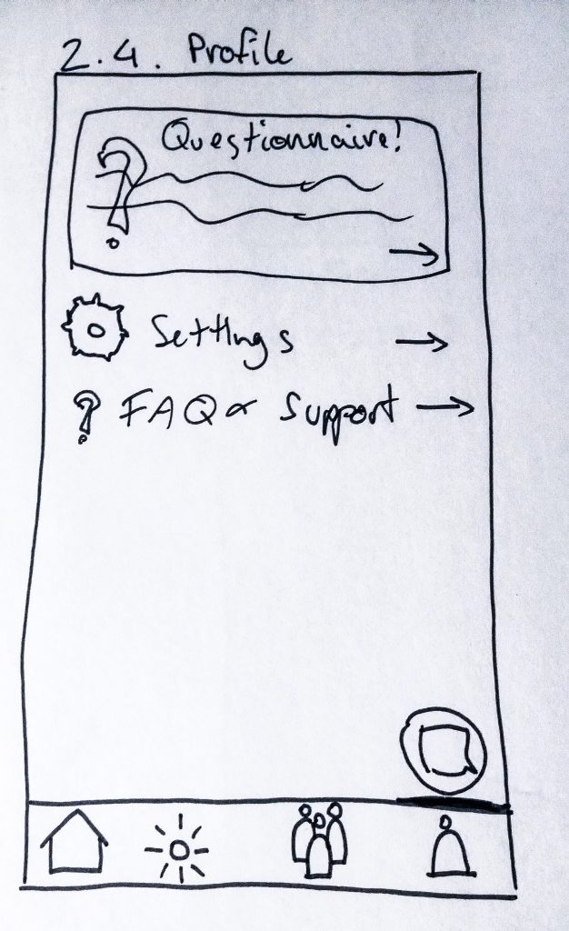
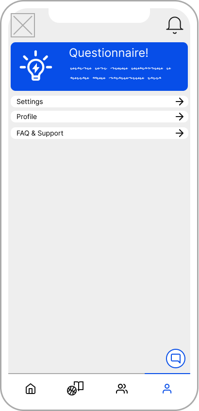
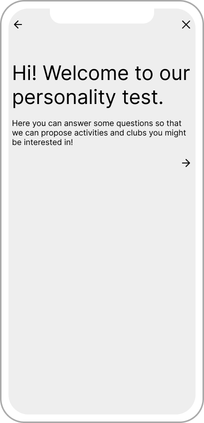
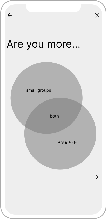
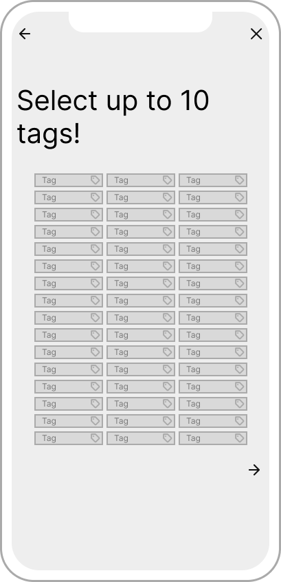
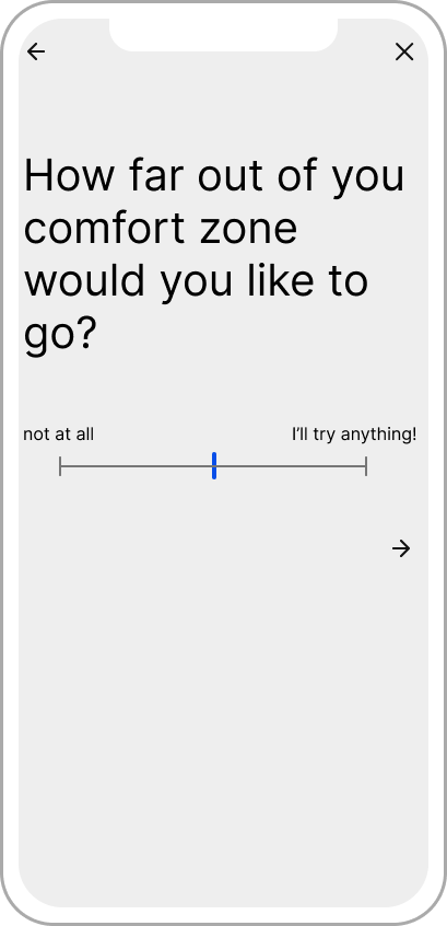
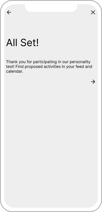
A user flow I explored on my own initiative is a questionnaire for undecided user that might need additional help exploring activities. This questionnaire would explore personality, preferences and general fields of interest to tailor a personalised feed of activities and clubs for the user.
Visual: High-fidelity
Results and implementation: Affinity diagram
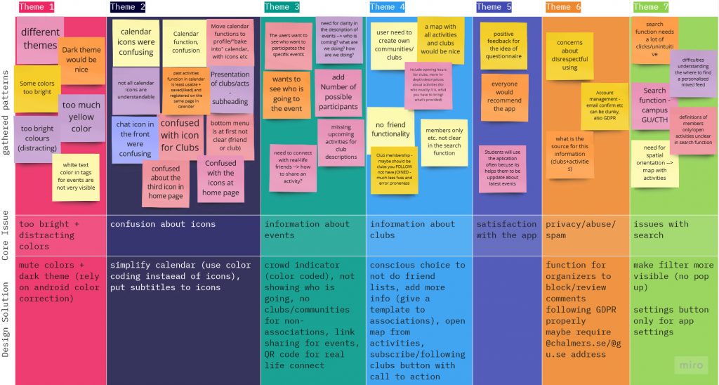
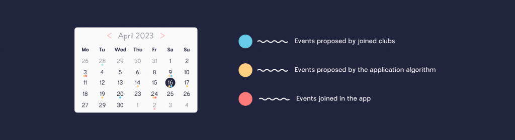
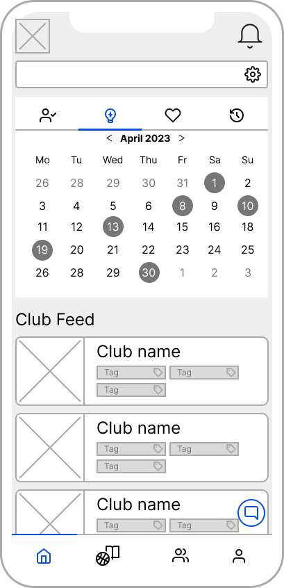
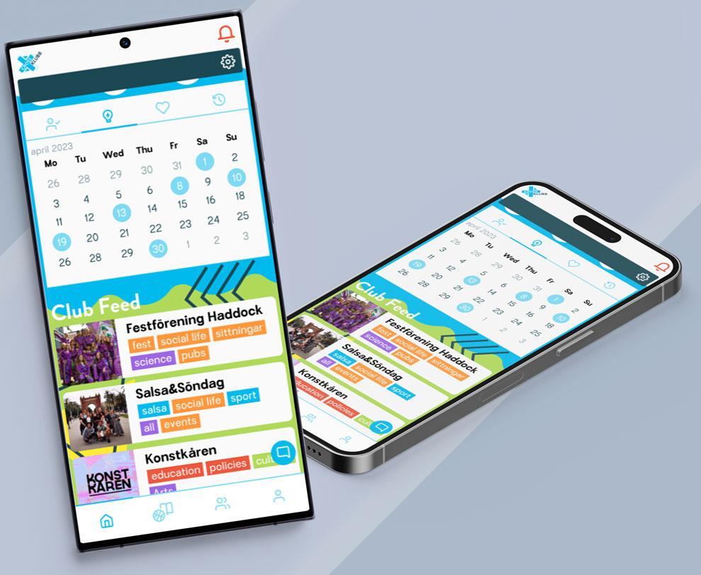
In order to clarify feedback and make concrete design decisions, I set up and lead an internal workshop using an affinity diagram. As we did not have time to implement this feedback, I incorporated some of it on my own. For example the color coding of the calendar to allow a user to analyse events of joined clubs, independent activities the user is interested in and activities proposed by the application at a glance.